KPI Dashboard
Dashboard concept for KPI overview.

Goal
To give managers an overview of the impact of AI on the company's key performance indicators.
Competitor analysis
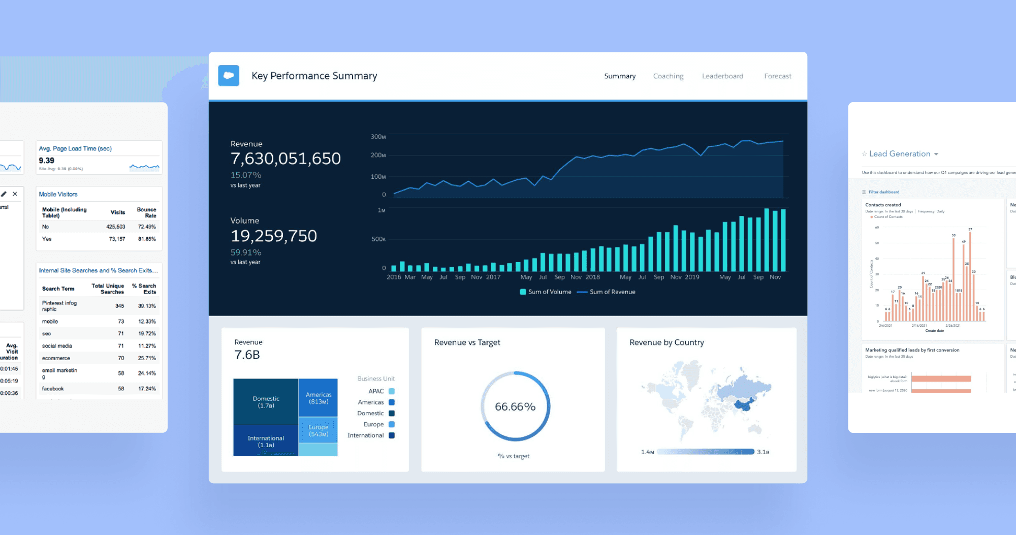
Our dashboard is like Salesforce Einstein, but focused on conversions with limited data sources.
Like Google Analytics, but uses a narrow set of info and requires less customisation.
Like Hubspot CRM, but prioritizes metrics directly related to closing sales.
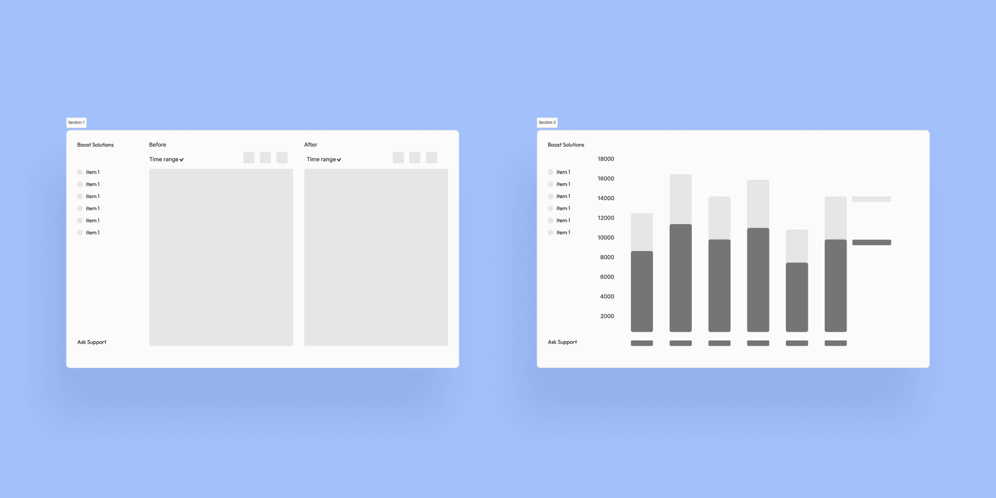
Drafts 1 and 2
The first wireframe had the idea to show each feature as before-and-after with a change of data block using the sidebar menu. Second, used vertical bars, but they did not fit into the data type.
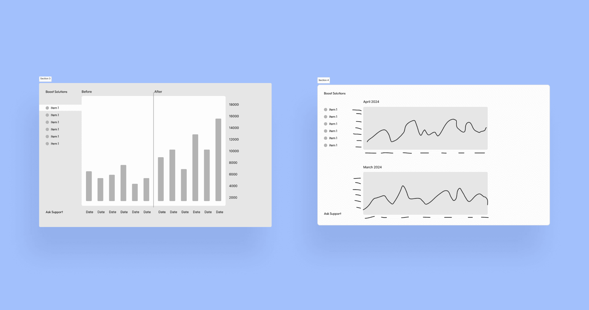
Drafts 3 and 4
Third used the manual before-and-after slider to control the view. Like on pictures with retouch. Fourth, separate each data block into an individual graph, which would take several screens to scroll and compare. Does not give an instant overview.
Desktop and mobile
After iterating on wireframes, I selected cards as the main dashboard component for their high mobile adaptability and easy comparison overview.
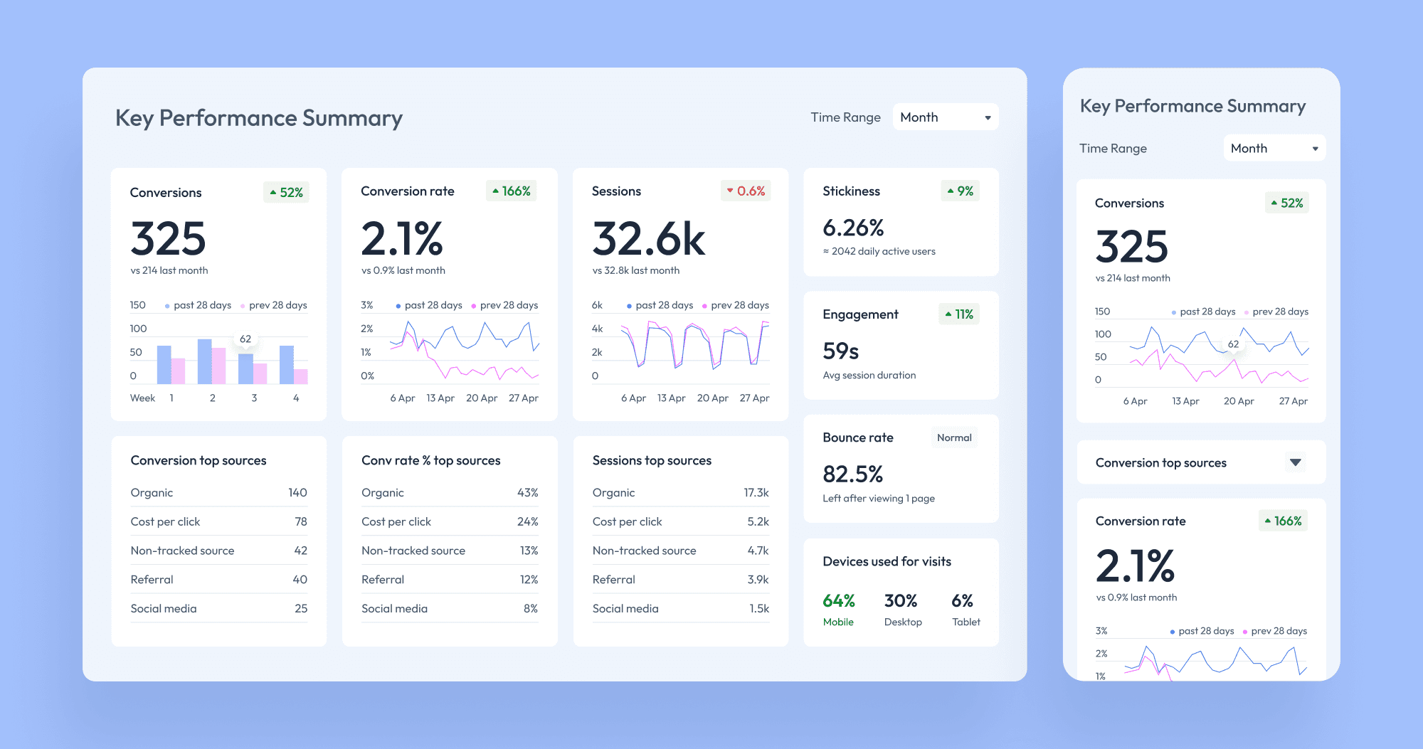
Results
The dashboard is fully mobile-responsive and provides key data for comparing metrics, helping estimate AI's impact on the company’s web performance.
7 metrics combined in one screen for a quick overview.
Credits
Anastasia Isachenko — UX/UI Design (1 week)


