Underwriting Dashboard
For evaluation of underwriter's performance in the insurance company. I worked on this flow in team with developers, managers and seniour underwriters.

Goal
To optimize the time underwriting leadership needs to decide on performance evaluation, workload distribution, and coaching.
Key user — Supervisor

The key user in this flow is the underwriter's supervisor. They want to:
Evaluate performance across colleagues underwriters.
Make fair decisions regarding promotions, bonuses, and dismissals.
Help middle and junior underwriters with escalated claims.
Have solid arguments to explain decisions to leadership.
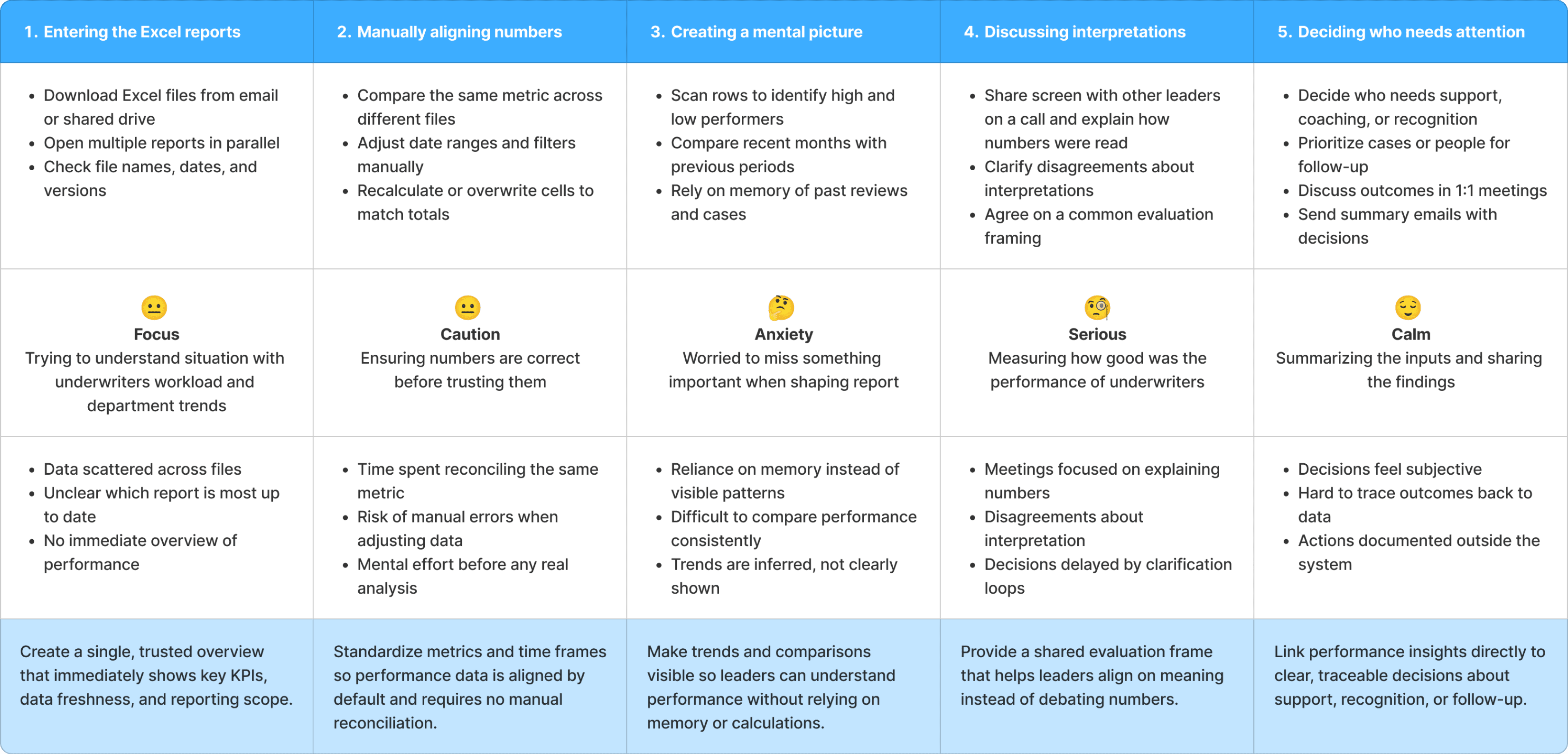
Problems
Interpreting data in complex Excel reports consumes most of the supervisors’ time.
As a result, supervisor has little time left to help fellow underwriters with escalated cases, often stepping in too late.
Supervisors sometimes argue with leadership when discussing underwriter performance, as they use different evaluation criteria.
Every 3 months, the whole department evaluates performance. Leadership decided that next time they wanted to approach this differently and initiated a plan to change the process. They secured the budget to create an MVP dashboard.
Goals
To find common ground on performance evaluation, to improve the atmosphere in team.
To free up time for supporting escalated cases by optimizing routine tasks.
To spot underwriters in need for mentorship before the tension escalates.
Discovery Workshop
I facilitated a discovery workshop to identify current pain points, desired outcomes, and potential hurdles in achieving them. It took place online and lasted 2 hours.
Together with senior underwriters and a developer, we shaped:
User portraits
Performance evaluation journey
Value proposition canvas
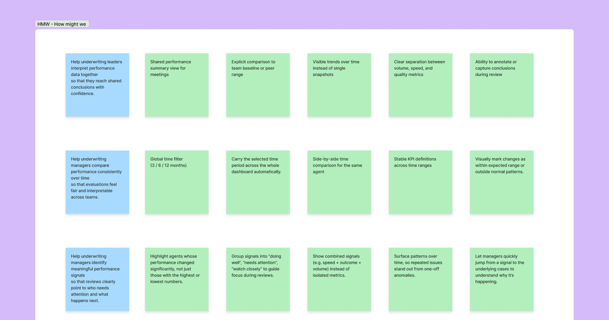
When problems were defined, we went through a brainstorming session using “How might we” framework.
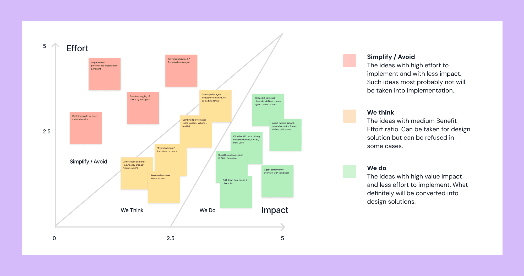
Then we mapped ideas into a two-factor analysis to identify which ones were worth implementing through team voting. We evaluated ease of implementation and user value on a five-point scale.
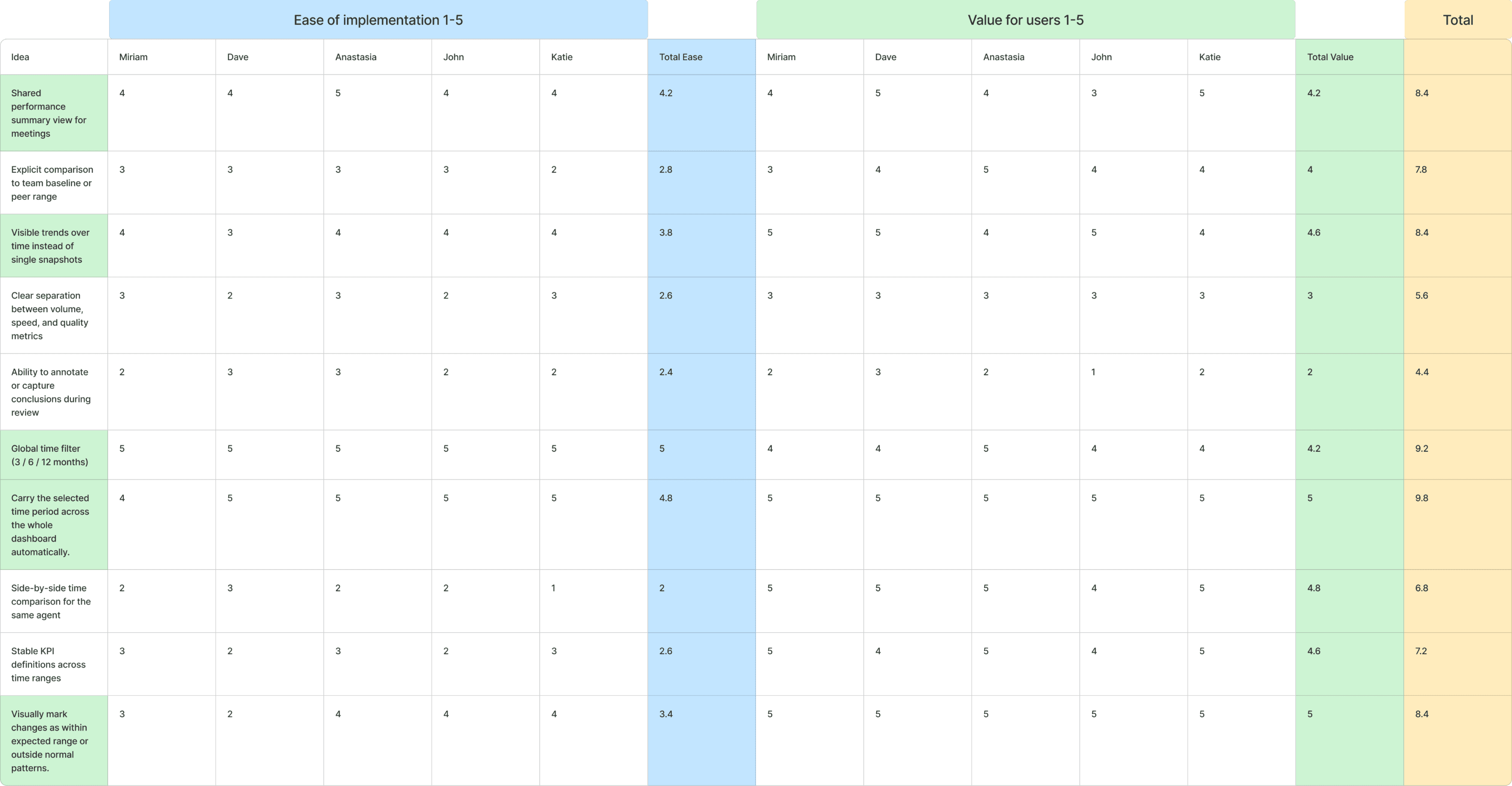
Prioritization was made using Impact/Effort mapping. Green ones went to production.
UI work scope
To achieve the goals, the following actions were taken.
Used “Untitled UI” design system
To maintain consistency across design and speed up the development process. Untitled UI has a very good collection of dashboard-specific elements and settings pages.
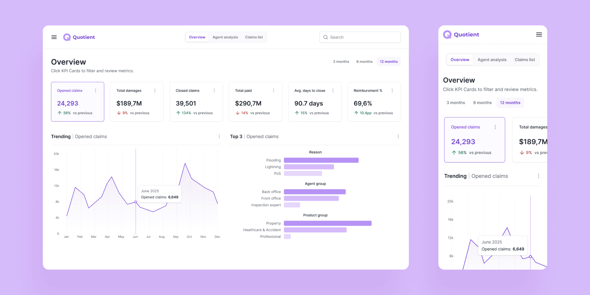
Defined consistent KPIs
Key performance indicators are assembled in the overview to give management a clear picture of the overall state before moving to individual cases.
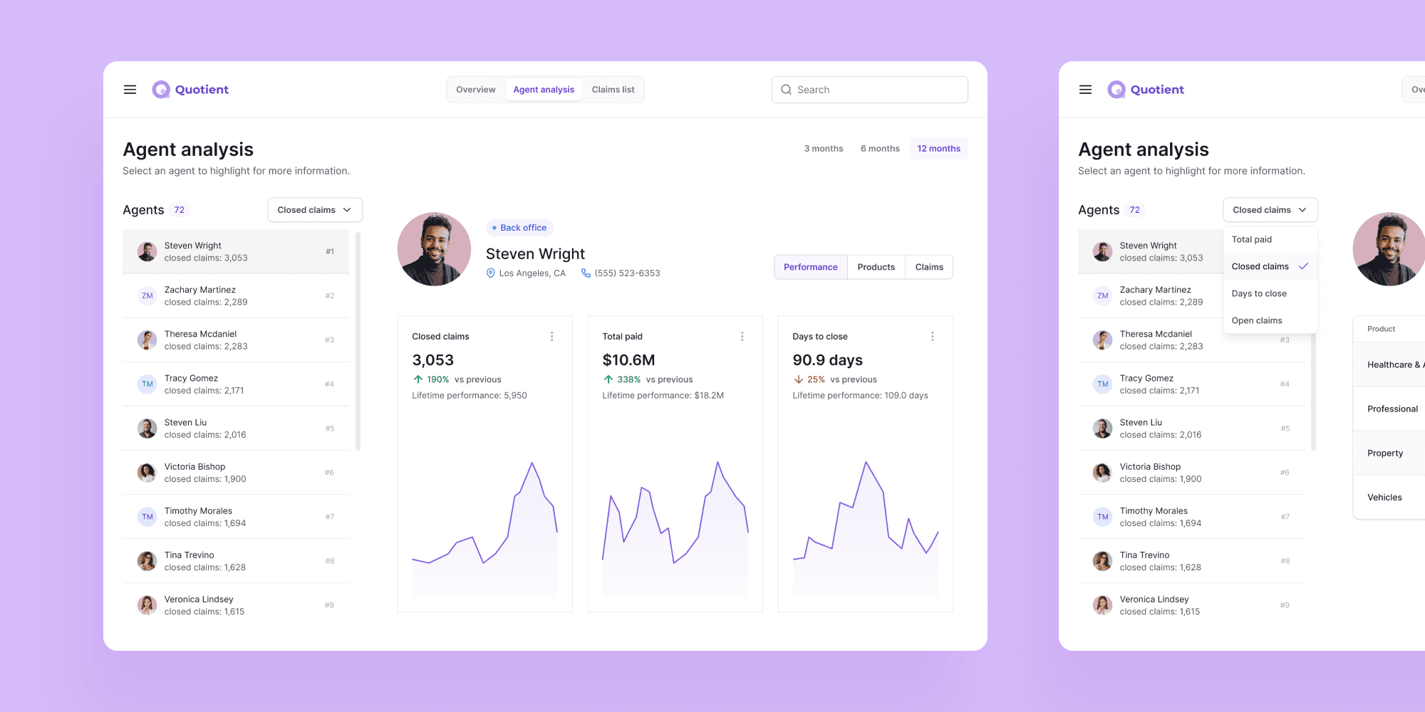
Introduced agent ranking
This helps management identify who is eligible for a bonus and who may need additional support.
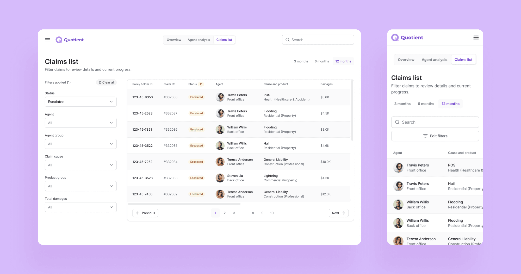
Defined filtering
To make scanning for escalated cases and other specifics easier. When clicking on a row, the manager sees case details and all involved individuals.
Before & After
Metric | Excel reports | MVP dashboard | Source |
|---|---|---|---|
Time to decision | 50 min | 25 min | Google Form Survey |
Decision alignment rate | 0.6 (6/10 cases) | 0.8 (8/10 cases) | Internal Google Spreadsheet |
# of follow-up clarifications per review | 1-2 follow-ups | 0-1 follow-up | Google Form Survey |
Results
Consistent KPI definitions across all views, fixed evaluation periods, and agent ranking helped to reduce time needed to identify issues and number of follow-up clarifications per review.
Time needed to make a decision reduced from 50 min to 25 in average, compared to work exclusively with Excel reports. Source: 24 user responses in Google Forms survey.
Credits
Anastasia Isachenko — UX/UI Design, workshop facilitation (3 months)
Senior underwriters — domain expertise
Developer — feasibility evaluation

