Bank Payment Flow
I took the initiative to redesign the payment flow of the app I was using. The project is non-commercial. The concept is focused on the issue with the payment process and the onboarding of new users.
Goal
To reduce the time needed to make the first payment in the app, + improve subjective satisfaction rates.
Problems to solve
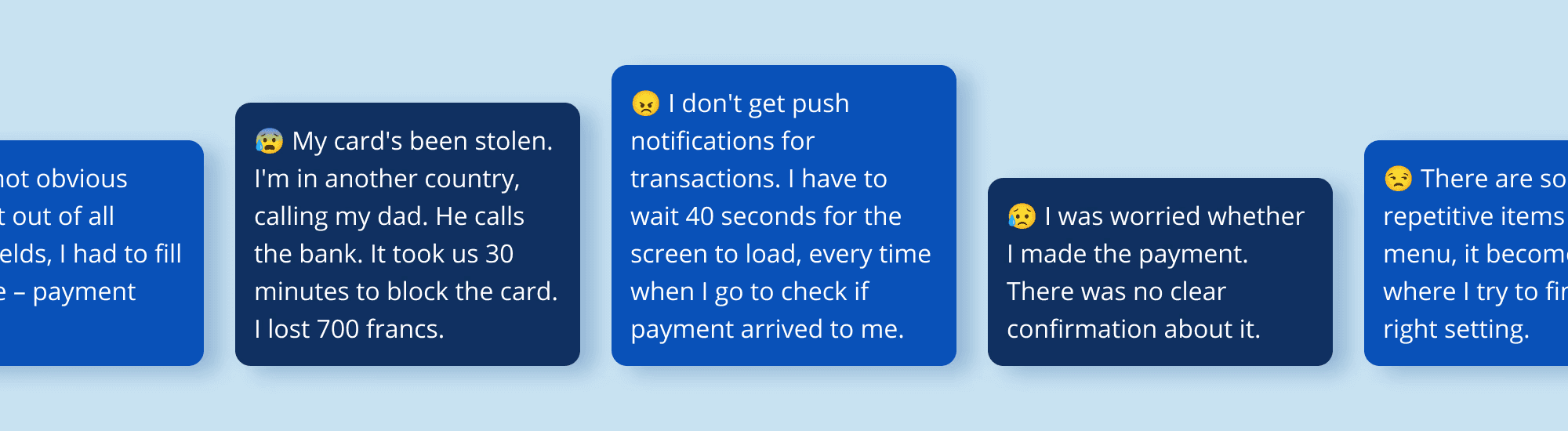
20 minutes are needed to make a payment when first using the app. Most immigrants I spoke to had to ask for help when making their first payment transfers in a Swiss bank.
Low subjective satisfaction with the payment process. Users were not certain if the payment had been released or when it would be received. Pending payments were new to them.
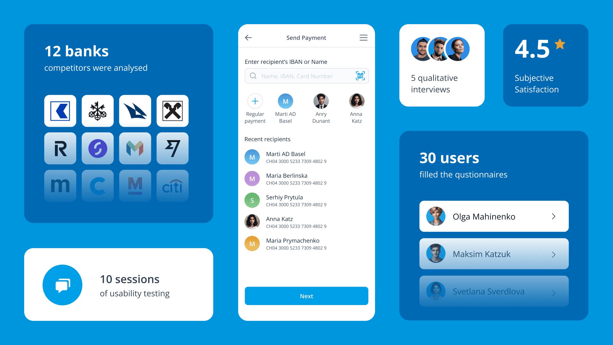
Research methods
Personal conversations in Telegram groups
Questionnaire in Google Forms, filled by 28 people
5 qualitative interviews in the format of a video conversation
Note
To avoid copyright concerns, I've hidden the original design, logo, and name of the banking application. Logo is a placeholder. The case shows only UI/UX redesign.
Work scope
To achieve the goal, the following actions were taken.
Analysed user reviews
The app has an average rating of 2.4 on App Store Reviews and 3.1 on Google Play. In reviews, users complained about the following.
Design looking “like Windows XP” (too old)
Support is hard to reach
Usability is years behind the competition (missing features)
Account balance is not obvious
No push notification options
Modernized the look
While respecting bank branding, I modernized it to be more competitive. I used principles close to Material Design Guidelines, but with light strokes instead of shadows.
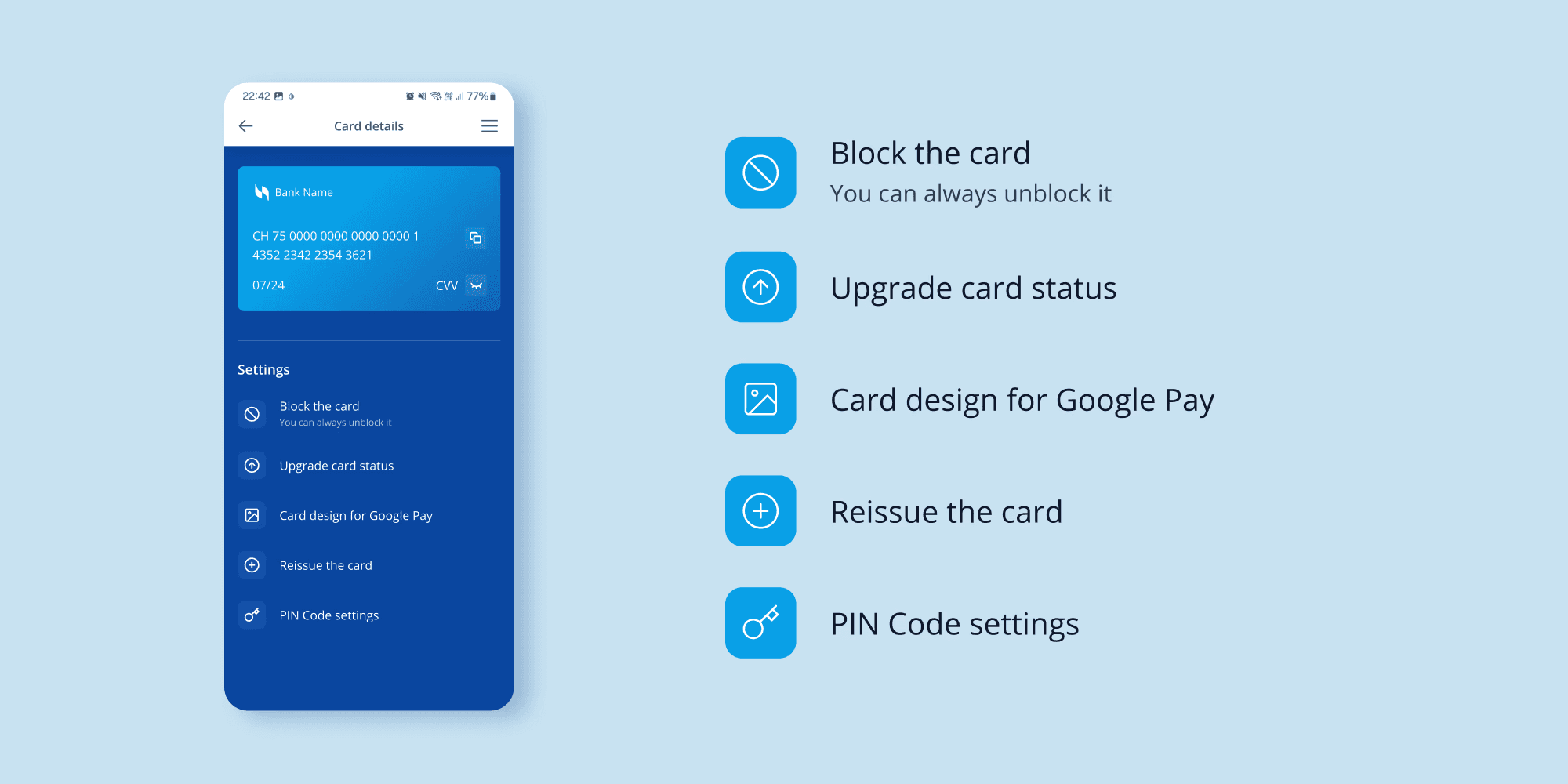
Minimized the load on customer support
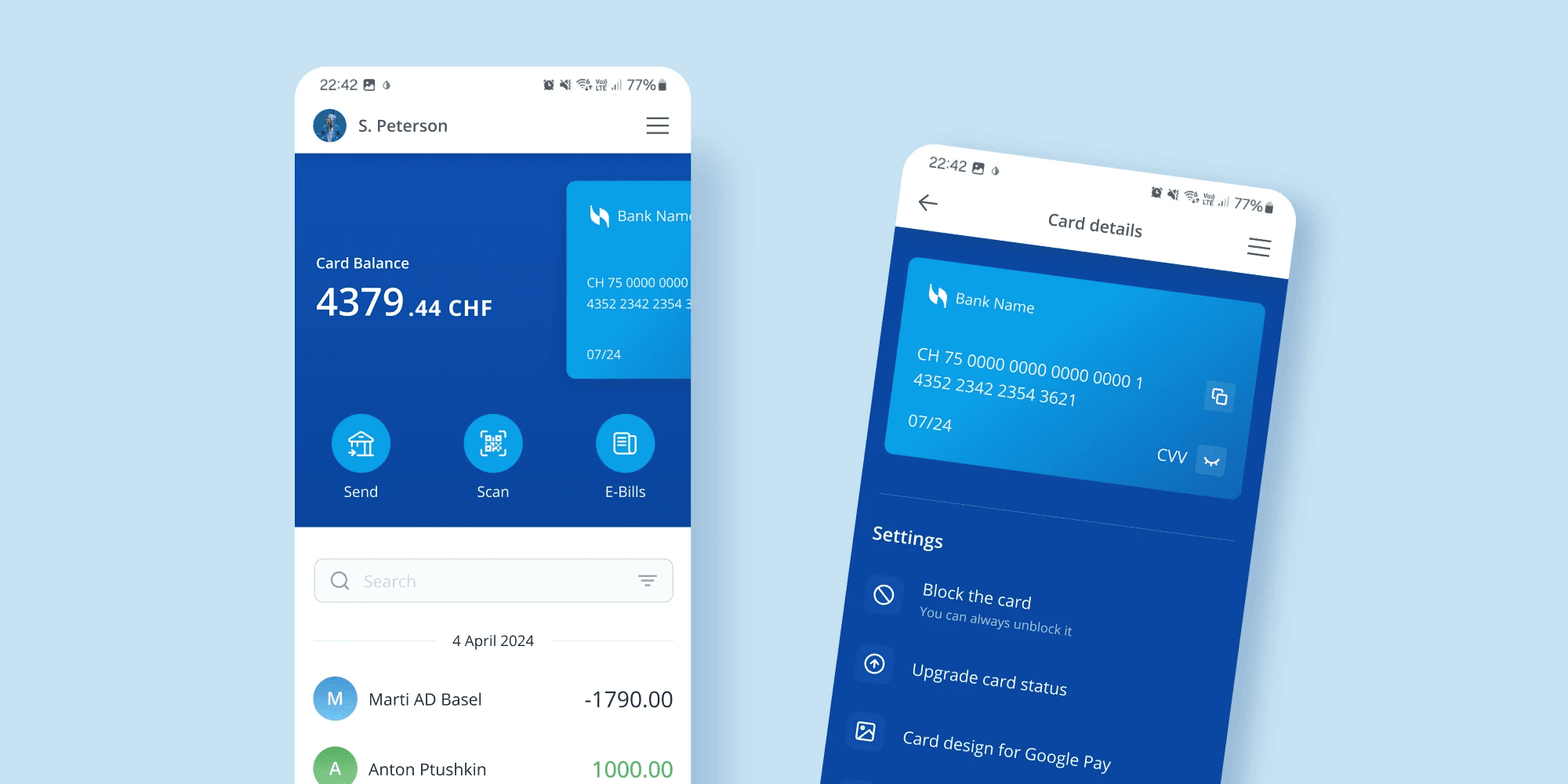
To achieve this, I added common card management requests under the card visual. For some users, it may save time for calls, for others, all their life savings, if the card is stolen.
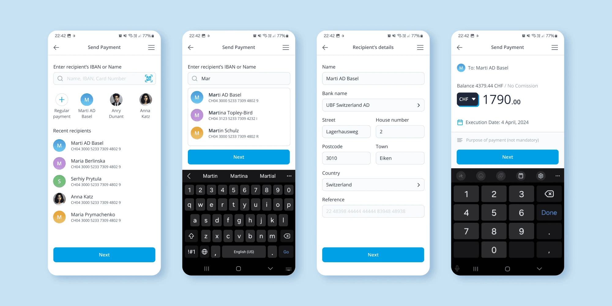
Added the possibility to automate regular payments
I asked users what they use the app for most often, and they indicated payments abroad, rent, and many regular payments. So I designed a possibility to automate them.
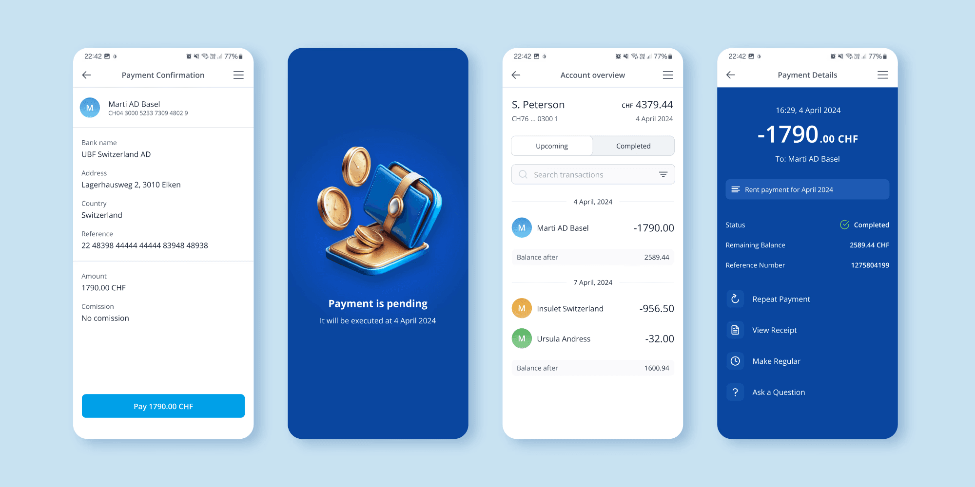
Made the account balance stand out
With a clean hierarchy in the app, you can now see the balance instantly, while also having access to the payment history, which was not present before.
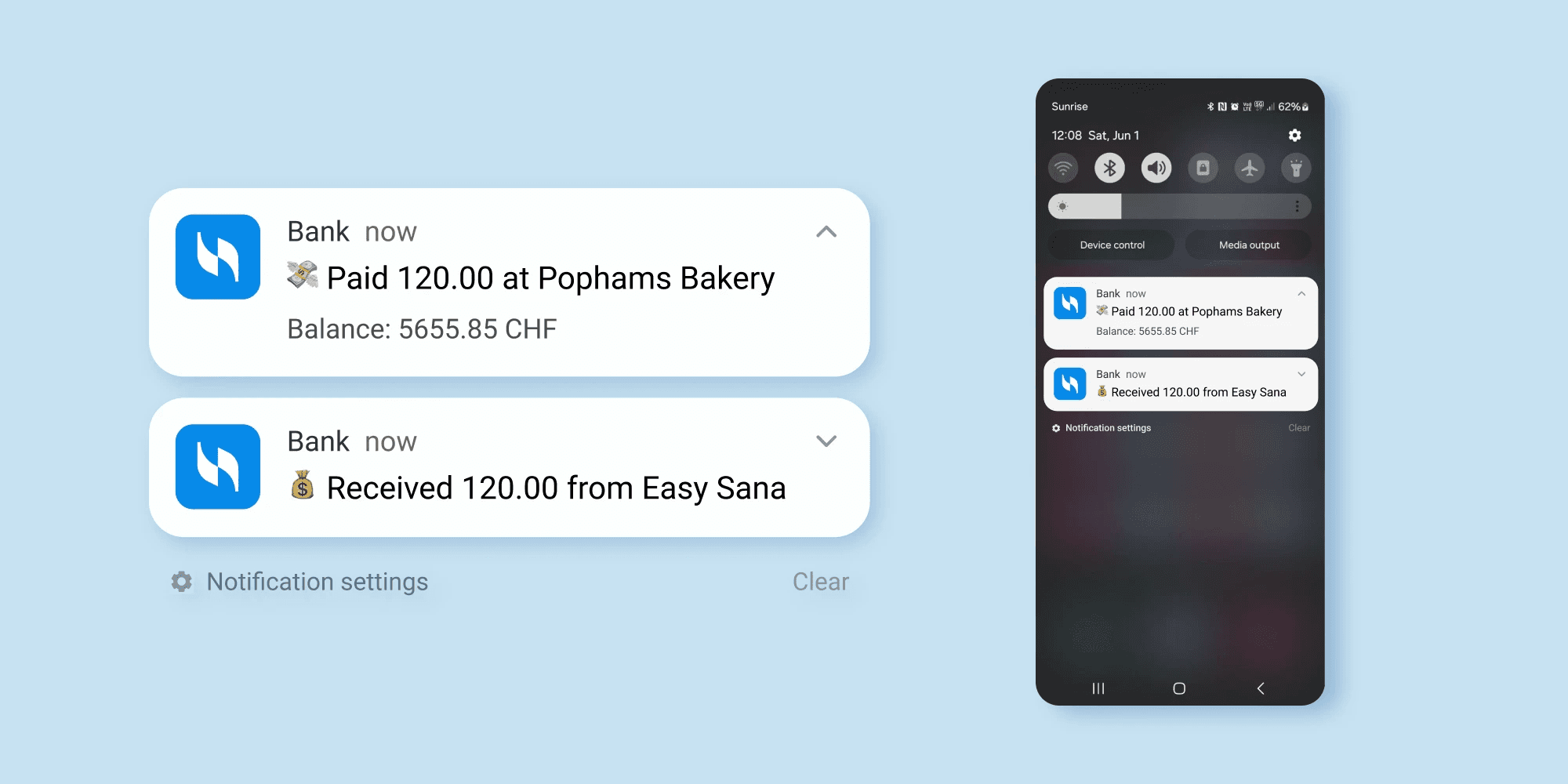
Designed push notifications
The bank could notify about the incoming and outgoing payments. So that users do not have to make unnecessary taps and wait for the app to load.
Results
Subjective satisfaction increased from 1.7⭐️ to 4.5⭐️. The time needed to make the first payment decreased from 20 to 5 minutes.
Based on 10 usability test sessions + 28 survey responses in Google Forms.
Credits
Anastasia Isachenko — UX/UI Design, Copywriting, Usability Testing (1 month)


